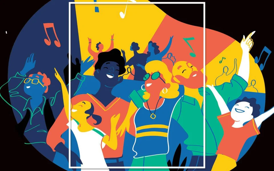
When it comes to promoting a party, one of the most effective ways to catch people’s attention is through a well-designed party flyer. A party flyer should be eye-catching, creative, and informative, providing party-goers with all the details they need to know about the event. But what are the dos and don’ts of party flyer design? In this article, we’ll cover the best practices and common mistakes to avoid when designing a party flyer.
Dos:
Keep it simple
A simple design is often the most effective. Choose a clear and concise message for your flyer and stick to it. Avoid cluttering the flyer with too many elements or using too many fonts.
Use a catchy headline
The headline is the first thing people will see on your party flyer, so it’s important to make it stand out. Use a bold, attention-grabbing font and keep the headline short and to the point. Use phrases that convey the theme and mood of the party, such as “Get ready to dance!” or “Join the fun!”
Include high-quality visuals
Your party flyer should be visually appealing and include high-quality images that represent the party’s theme. Use bright and bold colors to catch people’s attention and make sure the images are high-resolution to avoid pixelation. When it comes to creating a successful party flyer, it’s all about capturing the essence of your event in a single image. These Party Flyer Ideas will help you do just that.
Provide clear and concise information
The purpose of a party flyer is to provide potential party-goers with all the information they need about the event. Include the date, time, location, and admission details. Use bullet points and short sentences that make the data easy to read and understand.
Choose the right colors
The colors you choose for your flyer can help to set the tone for the party. Bright and bold colors work well for parties with a lively atmosphere, while muted or pastel colors may be more appropriate for a more sophisticated event.
Size
The size of a flyer can be an important consideration when designing and creating one. The appropriate size will depend on the purpose of the flyer and how it will be distributed. If you have any confusion about size then you should check the flyer size guide.
Make it stand out
Your flyer should stand out from the competition. Consider using a unique shape or size, or adding a special feature like a QR code or tear-off section. If you’re planning a party and want to make sure it stands out, take a look at these awesome party flyer templates.
Make it easy to share
Make it easy for people to share your design by including social media links or QR codes that lead to a webpage with more information about the event. This will help spread the word about your party and increase attendance.
Don’ts:
Don’t use too many fonts
Using too many fonts can make your design look cluttered and unprofessional. Stick to two or three fonts at most, and make sure they complement each other well.
Don’t use low-quality images
Using low-quality images can make your design look unprofessional and unappealing. Make sure all images are high-resolution and relevant to the party’s theme.
Don’t forget the white space
White space is the empty space on your flyer that helps to create a balance between the different elements. Don’t be afraid to use white space to give your flyer a clean and uncluttered look.
Don’t overload the flyer with information
While it’s important to provide all the necessary information, avoid overloading the flyer with too much text. Keep it simple and easy to read, with just the essential information.
Don’t forget the call-to-action
A call-to-action is a statement that encourages the reader to take action, such as “RSVP now” or “Get your tickets today.” Don’t forget to include a clear call to action on your party flyer to encourage people to attend.
Conclusion
In conclusion, designing a party flyer requires careful consideration of many different elements. By following these dos and don’ts of party flyer design, you can create a flyer that stands out from the crowd and gets noticed. Remember to keep it simple, use high-quality images, include the important details, choose the right colors, and make it stand out. And don’t forget the don’ts – don’t use too many fonts, don’t forget the white space, don’t use low-quality images, don’t include too much information, and don’t forget the call-to-action. With these tips in mind, you can design a party flyer that will help to build excitement and get people excited about attending your event.
